Dashboard
Use the Bigeye dashboard to get instant insights into the health of data pipelines and the quality of data over time.
Below is a high-level overview of each dashboard section:
- Monitoring coverage shows insights into tables currently monitored by Bigeye and gives an overview of coverage by data quality dimensions.
- Pipeline reliability summarizes the reliability of data pipelines by tracking data freshness and volume over time.
- Data quality summarizes data health by metric dimension type over time.
- Issue response enables performance monitoring by measuring interactions, the average time to resolution, and the number of issues closed.
- Collections provide a glance of open metrics and issues within given collections.
You can access the Dashboard from the menu in the left panel.
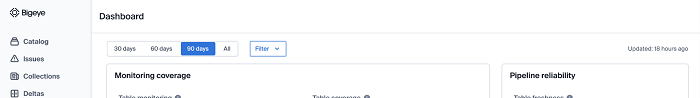
Set filters
You can use the time frame and data source filters to explore data and perform additional analysis.
- Fetch data for 30 days, 60 days, or 90 days. Select All to get a comprehensive view of the data available so far. The default time frame is 90 days.
- Filter data based on workspaces. You can multi-select from the list of workspaces you have access to. The default selection will be the current active workspace.
- Filter data based on the different data sources in your catalog.
All charts are populated as per the selected filters for time, workspace, and data sources.
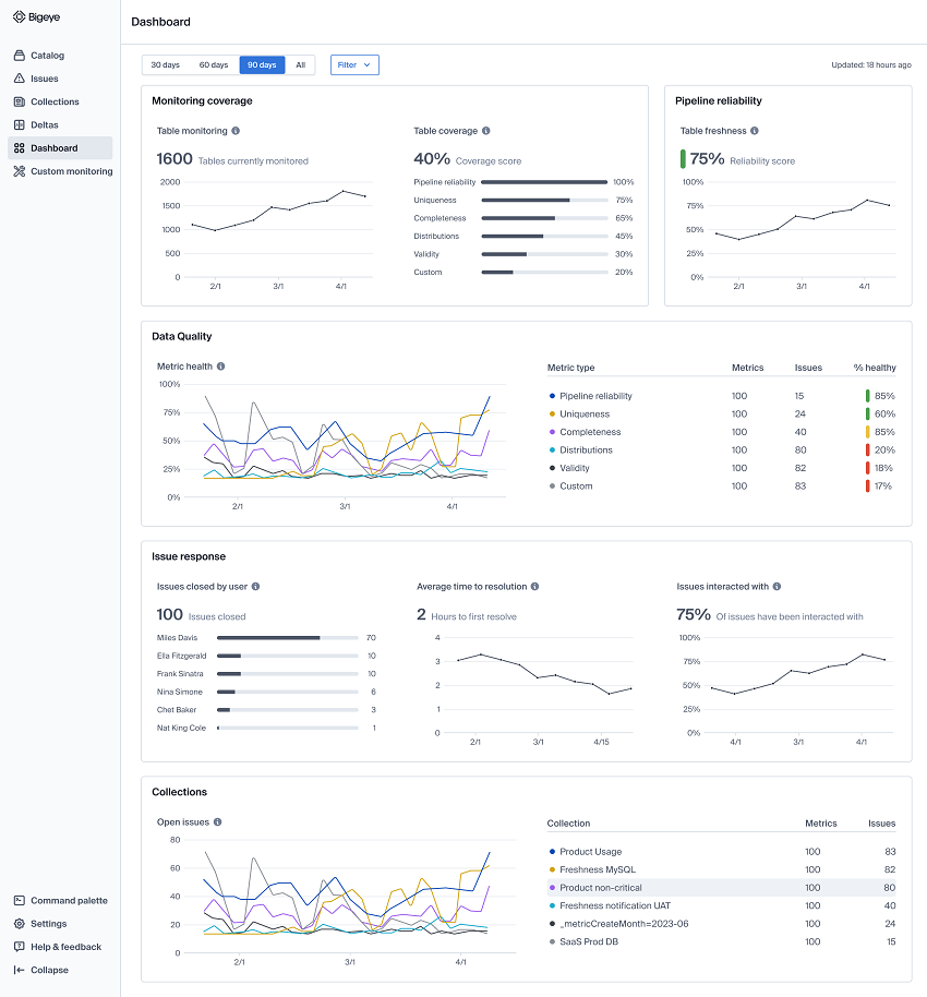
Monitoring coverage
Get insight into the number of tables that Bigeye currently monitors and the percentage of table coverage by different types of metrics. The Monitoring coverage section provides information on the following data:
Billable coverage
Tables with billable coverage are tables with one or more metrics or tables with one or more deltas.
Hours since last load (HSLL), Rows Inserted, Freshness, and Volume metrics are excluded from the billable tables count.
Coverage score
This category displays the total percentage of tables with one or more metrics deployed. The horizontal bar chart illustrates the percentage of tables with one or more metrics per metric category or dimension.
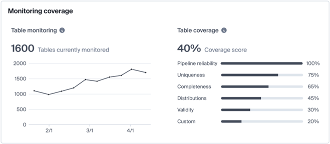
Bigeye recommends using insights from the monitoring coverage section to track Bigeye usage over time and find potential gaps in coverage that you may want to invest in.
For example, you may expect to have uniqueness checks on at least 50% of your tables. If you see that this number is 30%, you can take steps to increase your uniqueness coverage in Bigeye.
Pipeline Reliability
This section displays the reliability score, which is a reflection of the percentage of tables that are healthy. Bigeye monitors the reliability of data pipelines by tracking the freshness and volume of data inserted into tables. If data doesn’t arrive on time (freshness) or doesn’t include the expected number of rows (volume), then Bigeye flags this as a pipeline reliability issue.
The line chart in this section reflects the percentage of tables without an open issue for a given week.
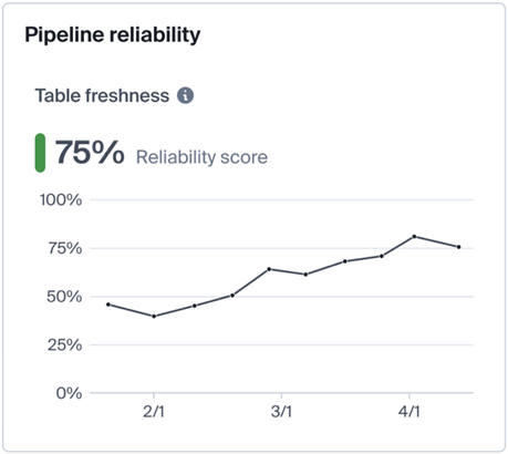
You can use the pipeline reliability and data quality charts to see trends in your data operations and understand if performance is improving over time. This information is useful for communicating progress to data executives.
Data quality
Track data quality over time to ensure data uniqueness, completeness, distributions, and validity meet business expectations.
Metric health: A graph of the metric health by metric dimensions over time.
Scoreboard: The total number of metrics and open issues for each dimension. It also displays % healthy, which is the percentage of metrics in a dimension with no open issues. Any percentage score below 50% is red, between 50% and 84% is yellow, and over 85% is green.
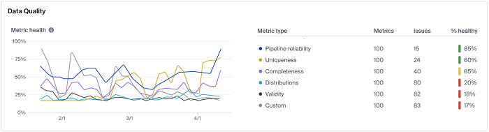
This section is interactive.
- Users can hover over each dimension under the Metric type column to view only its line on the Metric health chart. The user can also hover over each line on the Metric health chart to view dimension data points for each dimension type.
- If a user has filtered to a single workspace, they can also click on an issue count in the Issues column to navigate to the issues page filtered by that dimension type. This enables users to look at dimensional issues quickly and take action immediately. Note that this only works if you are filtered to a single workspace
Issue response
The issue response section enables teams to focus on and improve data quality by measuring and communicating performance.
- Issues closed by user: You can see the total number of issues closed at the top. The horizontal bar chart illustrates the issues closed by users in the filtered time frame. Note if a Bigeye user is present in this list, this is the number of issues that were auto-closed by Bigeye.
- Average time to resolution: Know the average time to resolve an issue for the current week. The time series chart shows the average time to resolve an issue for each week. The tooltip on hover of the time series shows the exact value of the average time to resolution for the selected week.
- Issues interacted with: This metric measures the percentage of issues that have been interacted with by a user. Interaction with means that the issue has been either closed, acknowledged, or is in a monitoring state. The time series shows the percentage of issues that have been interacted with for each week. The tooltip on hover shows the exact value of the percentage of issues that have been interacted with for the selected week.
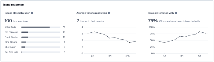
For data teams to focus on and improve data quality, they need an easy way to measure and communicate performance. This section provides a helpful starting point for understanding performance by monitoring the number of issues closed by each Bigeye user, the average time to resolution, and how many issues have been interacted with.
Using these data insights, you can set simple yet meaningful goals and communicate performance to business and data leaders across the organization.
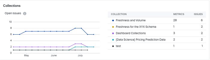
Collections
The time series shows the number of open issues by collection. Use the tooltip to view the open issue count grouped by week. The table displays the collections filtered based on data sources and workspaces, and the respective count of metrics and issues within these collections.
Only the top six collections based on issue count are displayed. To see all collections, navigate to the collections page.